Progress Bar Hits 100% and 41% Click Back to Double-Check
Why users second-guess a completed progress bar and what that hesitation reveals about trust, uncertainty, and feedback loops in interface design
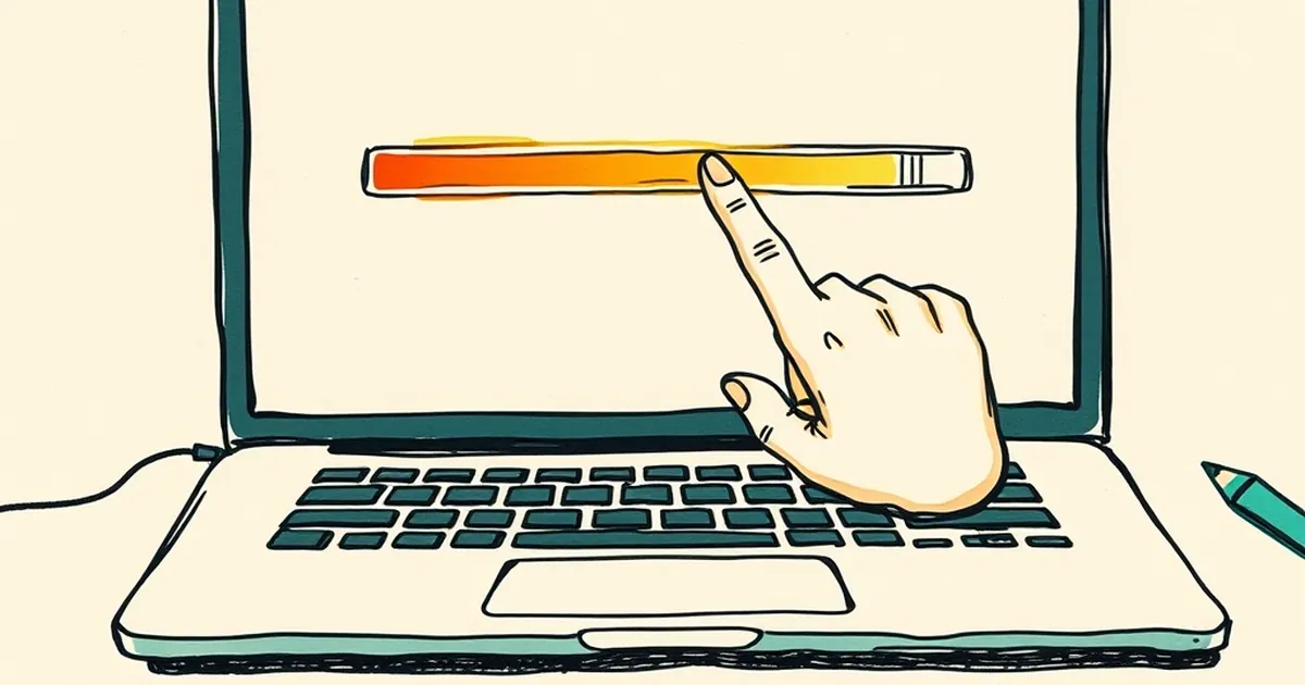
Why do we second-guess a finished task even when the screen says it's done? That small hesitation after a progress bar hits 100% is more than a quirk. It says something about how trust, uncertainty, and feedback loops shape the way people move through your site.
The 100% Problem
A progress bar is a promise. When it fills, the interface is telling the user: nothing left to do here. But a bar that jumps from 60% to 100%, or sits at 99% for three seconds, breaks that promise. The user starts auditing the system instead of trusting it.
This is where design and behavioral psychology collide. People don't experience completion as a binary state. They experience it as a feeling, and that feeling needs evidence. Nielsen Norman Group's research on response times has shown for years that perceived performance matters as much as actual performance. A fast load that looks stalled feels slow. A finished task that looks unfinished invites a click back.
That 41% figure isn't random noise. It's what happens when the interface gives people a reason to doubt the ending.
Variable Rewards and the Double-Check
Behavioral psychology has a well-worn concept here: variable-ratio reinforcement. B.F. Skinner found that unpredictable rewards produce more persistent behavior than predictable ones. That's usually discussed in the context of habit formation, but it cuts both ways. Unpredictable outcomes also produce persistent checking.
If your confirmation screen sometimes loads instantly and sometimes hesitates, users learn that the ending is unreliable. So they check. And once checking becomes a habit, it survives even after you fix the latency. The behavior outlives the cause.
The design lesson: consistency at the finish line is worth more than speed anywhere else in the flow.
Loss Aversion at the Finish Line
Kahneman and Tversky's work on loss aversion gives the other half of the picture. People weigh potential losses more heavily than equivalent gains. At the end of a task, the perceived loss isn't the task itself. It's the record of the task. Did the order go through? Did the form save? Did the payment clear?
A user who clicks back isn't being indecisive. They're protecting against a loss they can't verify. The fix isn't a bigger checkmark. It's specificity: an order number, a timestamp, a plain-language sentence confirming what just happened. Vague success messages ("All done!") read as decoration. Specific ones read as evidence.
Designing Endings People Trust
A few practical moves that come out of this:
- Never fake the last 10%. A progress bar that lies once teaches users to distrust every bar on your site.
- Confirm in the user's language, not yours. "Your invoice was sent to the address on file" beats "Success."
- Give the ending a stable shape. Same layout, same position, same tone every time. Predictability is what lets the checking habit fade.
- Make the back button unnecessary, not forbidden. If someone clicks back, they should land somewhere that still makes sense.
What to Watch Next
The interesting frontier is designing for earned confidence rather than manufactured certainty. As more business sites hand off tasks to automated flows, the finish line becomes the only place users can verify anything. That makes the ending the most important screen you'll design this year, and the one most teams still treat as an afterthought.
Start by auditing your last screen. Ask a real user to complete a task and watch their hands, not their face. If they reach for the back button, you've found your next design brief.
— creative mess