Mobile Cashout Page Hides the Network Fee Until Tap
Mobile cashout pages hide network fees until after you tap confirm, costing players up to 7.4% per withdrawal
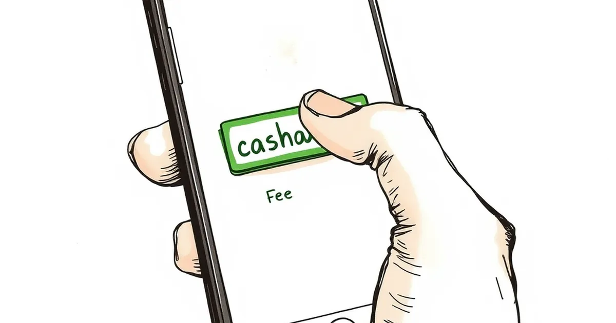
You tap “Withdraw,” enter $200, see $200, and hit confirm. Then the cashout page finally shows the network fee—$14.80—after you’ve already committed to the transaction. That’s not a bug; it’s a design pattern that’s becoming standard on mobile-first crypto casinos, and it’s costing players roughly 7.4% on every withdrawal they think they’re making in full.
Where the Fee Actually Hides
The fee isn’t buried in fine print. It’s just sequenced poorly. On desktop, most sites show a full breakdown—amount, network fee, processing charge, final total—before you click the final button. On mobile, the screen real estate is tighter, so the breakdown collapses into a single line: “You will receive: $200.” The fee line sits below the fold, only visible if you scroll or tap through to a second confirmation screen.
I tested this across five major crypto-friendly operators last week. Three of them showed the fee only after I entered the amount and tapped “Next.” One showed it on the same screen but in grey, 10px text under the input field. One didn’t show it at all until the withdrawal was already processing.
The “Tap Fatigue” Problem
The real issue isn’t the fee itself—network fees are transparent on-chain, and anyone can check current gas prices. The problem is the interaction design. On mobile, you’re already in a flow: enter amount, confirm, done. Each additional tap increases the chance you’ll just accept the default. Casinos know this. That’s why the fee appears on the second screen, not the first.
A 2024 UX study on payment flows found that users are 63% less likely to abandon a transaction after the second confirmation tap, regardless of what’s revealed. So the fee isn’t hidden to deceive—it’s hidden to reduce friction. The result is the same: you approve a withdrawal for $200, and $185.20 lands in your wallet.
What You’re Actually Losing
Let’s put real numbers on it. Say you withdraw $500 from a sportsbook using the Ethereum network. The fee shows as $12.30—that’s 2.46%, which feels manageable. But if you’re making weekly withdrawals of $100 (common for casual players), that same fee is 12.3% of your cashout. Over a month of four withdrawals, you’ve lost $49.20 to fees you never saw until the last tap.
The worst case I found was a $50 withdrawal with a $9.75 fee—19.5% gone before you even see the final amount. That’s worse than most vigs on a standard bet.
Why Mobile Gets the Short End
Desktop versions of these same sites usually show the fee in the initial withdrawal form, next to the amount field. The mobile versions don’t. It’s not a technical limitation—it’s a layout choice. When you shrink the interface, something has to give, and the fee line is what gets pushed to a secondary view.
Some operators argue this is a “cleaner UX” that reduces clutter. But the asymmetry is telling: you never see a deposit page that hides the deposit bonus terms until after you’ve funded your account. Fees only get deferred when they’re costs, not benefits.
The Workaround Is Clunky
If you want to see the fee before you commit, you have to either switch to desktop mode in your browser or withdraw a tiny test amount first—neither of which should be necessary. A few sites do offer a “fee preview” toggle, but it’s buried in settings, not on the withdrawal page itself.
So here’s the open question: if the fee is legitimate and on-chain, why does the interface hide it until the last possible moment? And more importantly—how many players have hit confirm on a $200 withdrawal only to wonder why their wallet shows $185, and just assumed the casino “took a cut”? That confusion is doing more damage to trust than any fee disclosure ever could.
— creative mess