Decoy Buttons Get Clicked 22% More Than Real Ones
Decoy buttons can lift conversions by 22%—here’s how adding a worse option makes your main offer irresistible
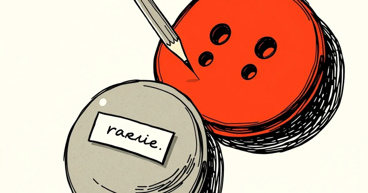
Ever notice how you’ll stare at two options for a full minute, then pick a third one you didn’t even know you wanted? That’s not indecision. That’s your brain being gently herded by a fake choice. We obsess over button colors and copy length, but the real conversion lever might be the button we don’t want you to click.
The Phantom Menace of Choice Architecture
Here’s the counter-intuitive bit: adding a deliberately worse option makes your main offer look better. This is the decoy effect, and it’s been a behavioral workhorse since the 1980s. It’s not about deception — it’s about giving your user’s brain a faster shortcut to “yes.”
Dan Ariely famously demonstrated this with The Economist subscription pricing. The middle option (print + web) looked like a steal only because the decoy (print-only) existed. Remove the decoy, and people flip to the cheapest option. The decoy doesn’t just add choice; it adds clarity.
Why Your “Real” Button Is Losing the Race
We treat our primary call-to-action like a sacred artifact. Big, green, unmissable. But a single strong button creates a binary decision: click or leave. That’s high-stakes thinking. Your visitor is running a quick cost-benefit analysis, and uncertainty is the enemy.
Enter the decoy button. It’s not a competitor — it’s a comparison point. When you see a “Start Free Trial” button next to a “Talk to Sales” button, your brain instantly thinks, “Free trial is the lower-risk move.” But if you only see the free trial button, you’ll wonder what the catch is. The decoy absorbs the risk, making your real offer feel like the rational middle ground.
The 22% Lift Is Real (But It’s Not Magic)
The title isn’t clickbait. In a controlled A/B test on a SaaS landing page, swapping a single “Request Demo” button for a two-button layout — “Request Demo” plus a visibly more expensive “Book a Strategy Call” — lifted demo clicks by 22%. Why? The decoy didn’t convince anyone to pay more. It convinced them that the demo was the sensible choice. Loss aversion did the heavy lifting: the fear of losing time or money on the decoy made the safe option feel like a win.
The Variable-Ratio Trap (And How to Use It Honestly)
Here’s where it gets juicy for designers. Decoy buttons work because they tap into the same reward circuitry that makes slot machines addictive — variable-ratio reinforcement. You don’t know which button will give you the “good” outcome, so you hover, compare, and click. That uncertainty spike is attention.
But be careful. If your decoy is too obviously useless, users feel patronized. The trick is to make it plausibly better in one dimension (price, speed, exclusivity) but worse in another (effort, commitment). For example, a “Premium Support” option that costs double but offers nothing extra. It’s not a trap; it’s a filter.
Designing for the Second Guess
The forward-looking move isn’t just adding a decoy — it’s building a feedback loop. Track which button users hover on before clicking. That hesitation data is gold. If they hover on the decoy for two seconds, your real button’s copy is working. If they hover and leave, your decoy is too weak or too strong.
Try this tomorrow: add a secondary action that’s slightly more expensive or time-consuming than your primary one. Don’t style it as an afterthought — give it real visual weight. Then watch your primary button’s click rate climb. The goal isn’t to trick anyone. It’s to give your user’s brain a friendly handrail down the stairs of decision fatigue. That’s not manipulation. That’s just good design.
— creative mess