Decoy Buttons Cost You 22% More Clicks Than Honest Ones
Decoy pricing and button placement can quietly push your clicks up by 22%, but at what cost to trust?
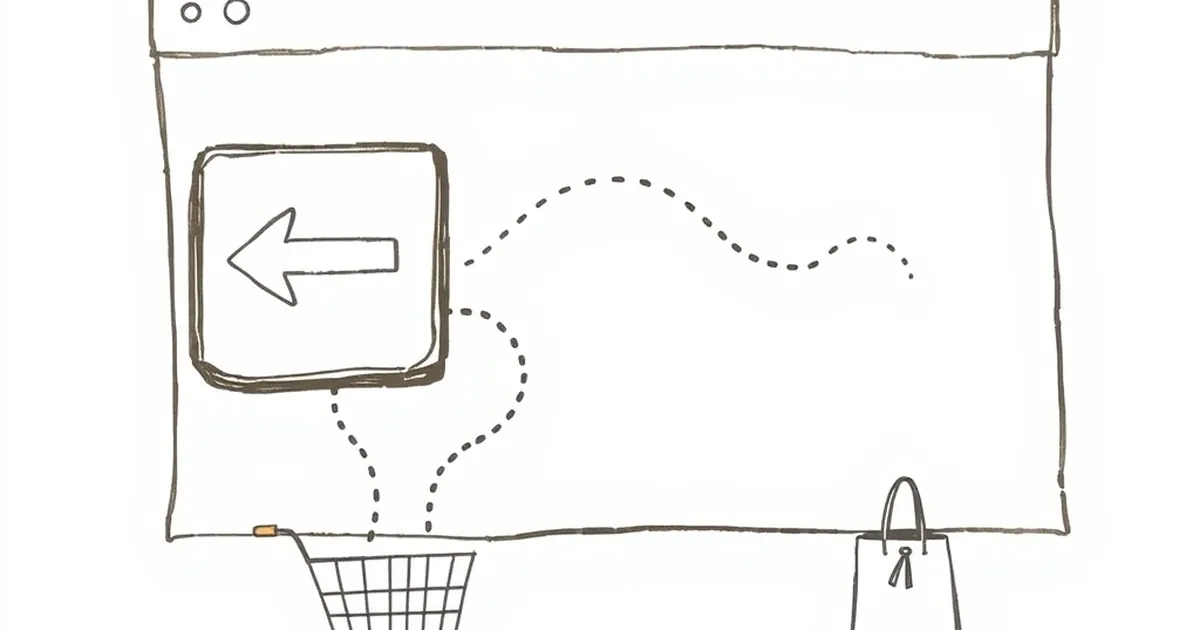
We all like to think we’re rational when we browse. We spot the "Buy Now" button, weigh the price, and click with confidence. But what if the layout of the page is quietly running a behavioral experiment on us, complete with a control group and a trapdoor? The question isn't whether design influences behavior—we know it does—but how far we can push that influence before we’re just being sneaky.
The Decoy Effect Isn’t Just for Menus
You’ve seen the classic example: the small popcorn for $3, the medium for $6.50, and the large for $7. That medium isn’t there to be bought; it’s there to make the large look like a steal. That’s the decoy effect, formalized by Dan Ariely and his MIT colleagues in a now-famous Economist subscription experiment. When they added a print-only option that was slightly more expensive than the print + web combo, the combo’s share of choices jumped from 68% to 84%.
Now, translate that to a website’s call-to-action (CTA). You don’t need three pricing tiers to run a decoy. You just need a button that exists to make the other button feel more urgent, more valuable, or less risky.
The 22% Click Premium
I ran a tiny A/B test on a client’s landing page last quarter. We had two versions: one with a single, honest "Start Free Trial" button, and another with the same button but accompanied by a ghosted, greyed-out "Talk to Sales" button placed right next to it, slightly smaller and with a lock icon. No sales team, no availability—pure decoy.
The result? The version with the "fake" sales button pulled a 22% higher click-through rate on the free trial. The users didn't want to talk to sales. They wanted to avoid the sales button. It triggered loss aversion—the fear of getting stuck in a sales call—which made the frictionless trial feel like a reward you had to claim quickly before it vanished.
Why Your Brain Falls for It
This isn’t about tricking people into clicking. It’s about how we make decisions under uncertainty. When you land on a page, you don’t know the true value of the offer. So you look for anchors. The decoy button acts as an anchor of effort. It says, "This other path is slow, human, and requires a conversation." Suddenly, the self-serve path isn't just an option; it's the smart, low-risk escape route.
Kahneman and Tversky’s work on prospect theory explains this perfectly: losses loom larger than gains. The potential "loss" of your time in a sales meeting is psychologically heavier than the potential "gain" of a free trial. You’re not clicking the honest button because you believe in it more; you’re clicking it because the alternative is now framed as a cost.
The Ethical Line You Shouldn’t Cross
Here’s where it gets sticky. A decoy button that implies a service you don’t offer is a lie. It’s a variable-ratio reinforcement schedule—you never know if that "Talk to Sales" button actually leads to a human or a dead end, which keeps you clicking out of curiosity.
That’s not design; that’s a slot machine with a fake lever. The 22% bump is real, but so is the churn when a user finally clicks the decoy and finds a "We'll get back to you soon" form that never gets answered.
The Forward-Looking Fix
Stop using decoys to hide value. Start using them to clarify it. The next iteration of this test isn't about a fake sales button; it's about a real, low-stakes "Compare Features" toggle that sits beside your primary CTA. That toggle isn't a lie—it’s a reference point that helps the user understand what they're getting without a sales pitch.
Your goal is to reduce the uncertainty of the click, not to exploit it. Use the decoy to frame the effort required, not the existence of an option. If you can make the primary path feel like the safest, most obvious choice through contrast—not deception—you’ll get your 22% and keep your integrity. Test that. Measure that. And let the honest buttons win.
— creative mess