CSS Grid’s 12-Column Snap Lands 300ms Before Your Pause
Why your design instincts stall on tiny details—and how recognizing that mental pattern unlocks faster, bolder layout decisions
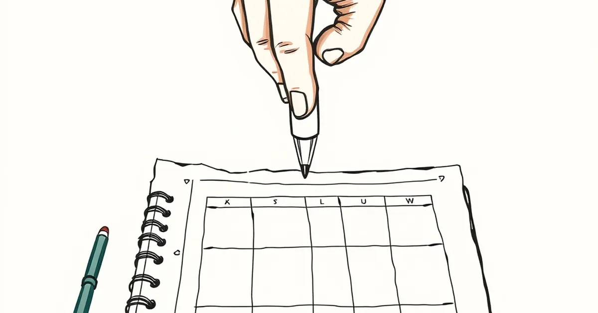
The web designer’s brain is a fascinating machine. You spend hours tweaking a hero section, convinced the issue is the font pairing or the negative space. Then you step back, squint, and realize the real problem is that you’re making decisions in a vacuum, waiting for a feeling of certainty that never comes. Why do we obsess over a 2px alignment shift for ten minutes, yet happily commit to a layout structure that we know is 80% right? The answer isn’t in your CSS file; it’s in your head.
The Illusion of the Perfect Pause
We tend to think of design decisions as rational, linear processes: research, sketch, build, review. But behavioral economist Daniel Kahneman would call this a fantasy. His work on System 1 (fast, intuitive) and System 2 (slow, deliberate) thinking shows that most of our micro-decisions—like whether to use grid-template-columns: repeat(12, 1fr) or a simpler 6-column split—are made by System 1. It’s a pattern-matching machine that seeks the familiar.
The problem arises when we hover over the "Publish" button. That’s when System 2 kicks in, suddenly critical and full of doubt. We enter a state of loss aversion, where the fear of shipping something slightly off feels heavier than the joy of shipping something functional. So we pause. We tweak. We convince ourselves that one more pixel of padding will fix the anxiety.
Variable-Ratio Reinforcement in the DevTools
Here’s where it gets juicy. Why do we keep refreshing the browser preview? Why do we find it so hard to stop tweaking a gradient that already looks fine? This is B.F. Skinner’s concept of variable-ratio reinforcement in action.
In behavioral psychology, this is the most addictive schedule of rewards. You don’t know when the reward (a perfect layout snap, a clean alignment) will come, but you know it might come on the next refresh. That uncertainty is a dopamine loop. For a designer, the DevTools console is our slot machine—except the payout is a pixel-perfect grid, not a jackpot.
The kicker? This is actually useful in moderation. The uncertainty forces you to experiment. But when you’re stuck in a loop of "just one more tweak," you’re no longer designing; you’re playing a game with a house edge that favors indecision.
Risk-Taking in the 12-Column World
Let’s get concrete. You’re building a dashboard. You have a 12-column grid. You know the data table needs 8 columns, and the sidebar needs 4. Obvious, right? But what about the card that sits between them?
A risk-averse designer will stick to the grid math, ensuring the card is exactly 5 columns wide with a 1-column gutter. A more competitive—or playful—mindset asks: What if the card breaks the grid and spans the full width, but only for a specific viewport? That’s a risk. It might look broken on mobile, or it might create a delightful focal point.
Research on decision-making under uncertainty suggests that experts are better at this not because they predict the future, but because they have better error recovery loops. They know that a failed experiment in CSS is cheap to revert. The cost of inaction (the pause) is often higher than the cost of a failed commit.
The Study That Changes How You Refactor
Consider the 2011 study by researchers at the University of Chicago on "The Burden of Choice." They found that when participants were given too many viable options (like 12 different grid configurations), their satisfaction with the final choice dropped, and they spent significantly longer deciding.
Sound familiar? That’s your 12-column grid. The solution isn't fewer columns; it’s a decision deadline. Set a timer for 300 milliseconds. When you make a structural choice, commit to it for 10 minutes before you allow yourself to open the inspector again.
The Future Is a Faster Fail
The practical shift here is to treat your layout not as a static artifact, but as a hypothesis. Stop waiting for the "right" answer to appear. Instead, use time-boxed experiments.
- The 5-Minute Rule: If you can’t decide between two spacing scales, pick one. Build it. Then, force yourself to look at it from a user’s perspective (not a creator’s) before you change it.
- The "Good Enough" Metric: Define what "done" means before you start. Is it a load time under 2 seconds? Is it a visual hierarchy that passes the squint test? If you hit the metric, you’re done. The pause is a luxury, not a requirement.
Your next project doesn’t need a perfect grid. It needs a grid that exists. The 300ms snap is your brain’s way of saying "this is good enough to move forward." Trust it. The undo button is right there, and unlike real-world risk, it doesn’t cost you anything but a moment of pride. Go build something that loads faster than your doubt.
— creative mess