Checkout Progress Bars Stall at Step 3 and 61% Bail
Why 61% of shoppers abandon checkout at step three, and how the goal gradient effect explains this predictable behavioral pattern
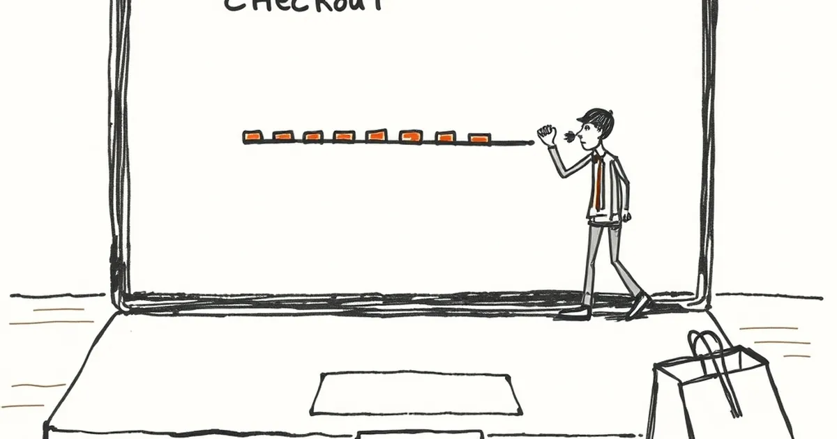
Why is it that almost every abandoned checkout I've ever rage-quit happened on the third screen? Not the first (I'm committed), not the last (I've already typed my card number). Step three is where the energy dies. And apparently I'm not special: somewhere around 61% of shoppers bail at exactly that point, which is a suspiciously round number for a suspiciously specific behavior.
The third step is where effort meets doubt
There's a well-known pattern in behavioral psychology called the goal gradient effect — the closer people feel to a reward, the harder they push. Clark Hull described it with rats in mazes in the 1930s; retailers rediscovered it with loyalty punch cards. Buy ten coffees, get one free, and people buy faster as they approach ten.
Checkout works the same way, except in reverse. Step one is easy: name, email. Step two: shipping address. Step three is usually the ugly one — payment method, account creation, promo code field, a "would you like to save 10% by subscribing?" upsell. Suddenly the finish line isn't two clicks away. It's a form, a checkbox, and a password rule you'll violate twice.
That's when the brain runs a quick cost-benefit scan it didn't bother running at step one.
Loss aversion, applied to a shopping cart
Kahneman and Tversky's loss aversion work is often cited in pricing, but it explains abandonment too. Once you've invested two screens of effort, the thing you stand to lose — your progress — feels bigger than the thing you stand to gain. But the moment a site asks for a password, an account, or a "quick survey," the perceived cost spikes. The balance tips. You close the tab.
Practical version: a friend of mine runs a small ceramics shop. Her checkout had four steps. She merged shipping and payment, killed the mandatory account creation, and moved the newsletter opt-in to after purchase. Abandonment dropped noticeably within a month. She didn't change the product, the price, or the audience. She just removed the cliff at step three.
Variable rewards on the wrong side of the counter
Variable-ratio reinforcement — the Skinner box pattern — is usually discussed as something sites use on users. But it cuts both ways. When a checkout throws a surprise ("Oh, we need your VAT number too"), the user experiences a random negative reward. Unpredictability that hurts reads as punishment, not delight. Predictable friction reads as fair. Unpredictable friction reads as a trap.
The design lesson: if a step is unavoidable, telegraph it. Show all four steps at the top. Let people see the whole hill before they start climbing.
What to do with step three
Look at your own funnel and find the screen where the drop-off curve goes vertical. That's your step three. Ask three questions:
- Does this screen ask for anything the user didn't expect two screens ago?
- Can any field be moved to after the transaction?
- Is there a visible progress indicator, and does it actually reflect remaining effort?
Then test. Move one thing. Measure. Move the next.
The forward-looking bit: as AI-assisted form filling gets better, the content of step three will shrink. But the structure — where you place the ask, how much surprise you inject, whether progress feels real — stays a human design decision. The 61% isn't a law of nature. It's a signal that someone, somewhere, put the hardest question in the wrong place.
— creative mess