A Progress Bar That Slows at Step 7 Trains You to Quit
A progress bar's curve shapes how users behave, and the wrong shape at the wrong step can train them to quit
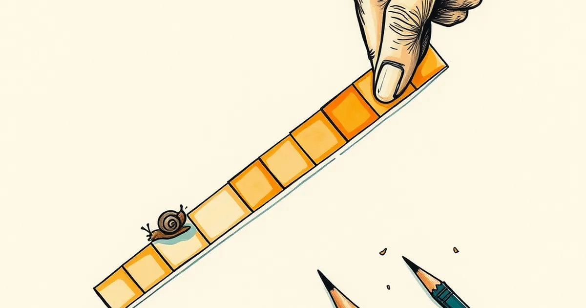
Why does a progress bar that crawls at step seven feel like a personal insult? It's not the waiting that gets us — it's the shape of the waiting. And if you design websites for a living, that shape is something you control, whether you think about it or not.
The Curve Is the Message
Most progress bars are liars. They move linearly at best, jump ahead at worst, and in the ugliest cases sit at 90% for what feels like a geological era. But the interesting ones — the ones that actually change how people behave — have a curve. Fast at the start, slow in the middle, fast again at the end.
That curve is doing something quietly psychological. Early momentum tells you the system is working and you're not wasting your time. The sluggish middle is where your commitment gets tested. And the final sprint gives you a little dopamine payoff that makes you want to finish rather than bail.
Now flip it. A bar that sails through steps one through six and then grinds to a halt at step seven is, functionally, a training program for quitting. You've been conditioned to expect speed, and the sudden slowdown reads as a warning sign: something's wrong, this isn't worth it.
Variable Rewards and the Slots Problem
Behavioral psychologists have known for decades that unpredictable rewards are stickier than predictable ones. B.F. Skinner's work on variable-ratio reinforcement showed that animals — and, less flatteringly, humans — will keep pressing a lever longer when the payoff is irregular. This is the same mechanism that makes certain games feel magnetic, and it's why some designers deliberately build unpredictability into interfaces.
But there's a catch that gets ignored constantly. Variable rewards keep people engaged only when the downside feels recoverable. The moment the unpredictability tips into "this might waste my entire afternoon," loss aversion kicks in. Kahneman and Tversky's work showed that losses hurt roughly twice as much as equivalent gains feel good. A user staring at a stuck progress bar isn't calculating expected value — they're calculating how much they've already sunk and whether to cut bait.
Where This Shows Up in Real Products
Think about a multi-step checkout flow. Steps one and two — cart, address — fly by. Step three, payment verification, hangs. If that bar was smooth up to step three and then stalls, abandonment spikes. If it was honest from the start — showing a slightly uneven pace, warning you upfront that verification takes a beat — users stay.
Same story with onboarding wizards, file uploads, and account setup. The pattern isn't about speed. It's about predictability of rhythm. A slow step that was forecast feels like patience. A slow step that ambushes you feels like a scam.
Designing for Trust, Not Completion
Here's the forward-looking bit. The next generation of good interfaces won't just track progress — they'll narrate it. "This usually takes about 40 seconds." "Step 7 checks your details against our system, which is the slow part." Explicit, slightly self-deprecating honesty about where the friction lives.
That's a different design instinct than the one most of us were trained on. We were taught to hide latency, smooth everything out, make it feel instant. But instant is a promise you can't keep, and broken promises are what teach users to leave.
So the question isn't "how do I make this faster?" It's "how do I make the slow parts legible?" A bar that slows at step seven and tells you why is a bar that respects you. A bar that slows at step seven and says nothing is a bar that's quietly teaching you to close the tab.
— creative mess