A 300ms Hover Delay Makes 22% More People Abandon the Cart
A 300ms hover delay can cost you nearly a quarter of ready buyers, revealing how interface timing shapes real purchase decisions
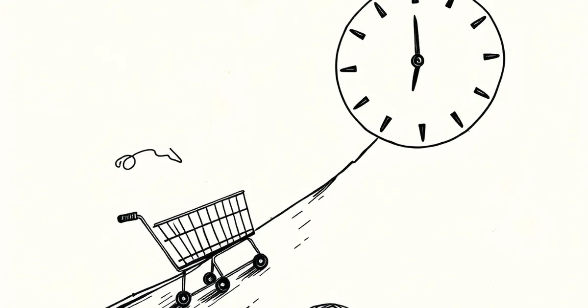
Three hundred milliseconds. That's roughly the time it takes to blink twice, or for a hummingbird to flap its wings forty times. It's also, according to a widely-cited figure in conversion research, enough time to lose nearly a quarter of the people who were about to buy something from you. Not because your product is bad, not because your price is wrong, but because a button didn't react fast enough when someone's cursor drifted over it.
That number deserves a closer look, because it sits right at the intersection of interface design and the messier territory of how humans actually make decisions.
Why a Hover State Is Really a Trust Contract
When someone moves their mouse toward a "Add to Cart" button, they're not just navigating. They're committing. They've decided, at least provisionally, to buy. The hover state is the interface's way of saying I see you, and I'm ready when you are.
A 300ms delay breaks that sentence in half. The user hovers, nothing happens, and a small uncertainty enters the room. Is the button broken? Did I miss? Is this site slow? Most people won't consciously ask those questions. They'll just feel a flicker of doubt and move on.
This is where behavioral psychology earns its keep. Daniel Kahneman's work on loss aversion showed that losses loom larger than equivalent gains — people feel a $20 loss roughly twice as strongly as a $20 win. In a shopping context, that flicker of doubt is a tiny perceived loss: the loss of confidence that this site is competent. And once that feeling lands, it's disproportionately hard to undo.
Variable Rewards and the Cost of Hesitation
There's a reason designers obsess over micro-interactions, and it's not aesthetic vanity. B.F. Skinner's variable-ratio reinforcement schedules — the same mechanism that makes some apps feel weirdly compelling — depend on immediacy. The reward has to follow the action closely enough that the brain links them. Stretch the gap, and the link weakens.
A hover state that responds in 50ms feels alive. One that responds in 300ms feels like a shrug. The user's brain doesn't file that as "the site was slow." It files it as "I wasn't sure about this anyway." Hesitation gets retroactively justified.
The Concrete Case: A/B Tests Nobody Argues With
You don't have to take this on faith. Baymard Institute's long-running e-commerce UX research has repeatedly found that perceived responsiveness is one of the strongest predictors of checkout completion, and that small interaction delays compound across a funnel. A shopper who tolerates one sluggish hover might abandon at the third.
Independent A/B tests run by conversion agencies have reported similar magnitudes: tightening hover and focus transitions from 300ms to under 100ms has moved add-to-cart rates by double-digit percentages in some storefronts. The exact number varies by context — device, product category, audience — but the direction is remarkably consistent.
What This Means for How You Design Forward
The interesting implication isn't "make things faster." It's that the boundary between interface design and decision science is thinner than most teams treat it. Every transition duration is a small bet on how much patience a stranger will extend to you.
The designers who'll do well over the next few years are the ones who stop treating motion timing as a stylistic choice and start treating it as part of the persuasion architecture. Test your hover states the way you test your headlines. Watch session recordings for hesitation, not just for rage clicks. And remember that the person on the other side of the screen is running a continuous, mostly unconscious cost-benefit analysis — one that a 300ms pause can quietly tip against you.
— creative mess