71% Keep Clicking After the Progress Ring Stalls at 90%
Why do we keep watching a progress ring stuck at 90%? The answer reveals how design choices quietly exploit human psychology
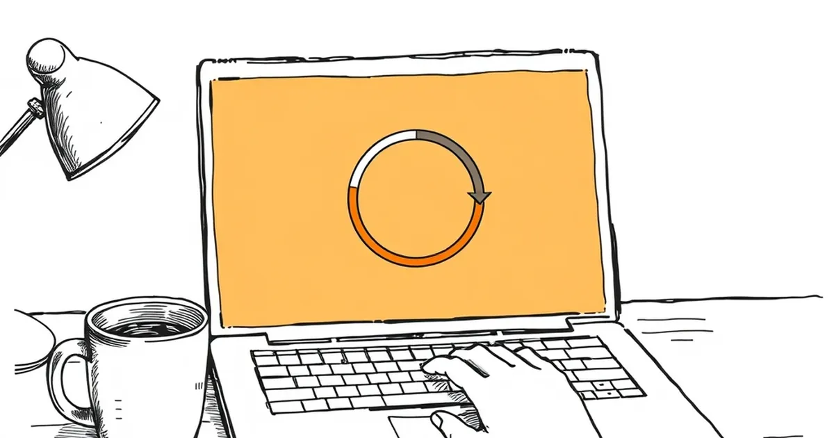
You've seen it a hundred times: the loading ring crawls to 90%, then just… sits there. And you keep watching. Not because you believe it's about to finish, but because something in your brain refuses to let go. So here's the question worth sitting with: why do we stay loyal to an interface that's clearly stalling us out?
The 90% Problem Is a Design Choice, Not a Bug
Most progress indicators aren't measuring anything real. They're animated estimations, and plenty of them are deliberately front-loaded — fast to 90%, slow to done. Designers do this because a bar that jumps instantly to 100% feels fake, and a bar that stalls at 90% feels like work is happening.
That's a strange trade. We're trading honesty for the sensation of effort. But the sensation of effort is what keeps people in the room.
Behavioral researchers have a name for the underlying pattern: variable-ratio reinforcement. B.F. Skinner's work on operant conditioning showed that unpredictable rewards produce the most persistent behavior — more persistent than consistent ones. A progress ring that almost completes, over and over, is a slot machine wearing a productivity costume.
Loss Aversion Is Doing the Heavy Lifting
Kahneman and Tversky's loss aversion research found that losses feel roughly twice as painful as equivalent gains feel good. Applied to interfaces, that means abandoning a stalled upload at 90% feels like losing the 90% you already invested — even though you never owned it.
This is the sunk cost fallacy with a progress bar attached. You've watched it climb. Walking away now means the watching was wasted. So you watch more.
Designers who understand this build it in on purpose. Designers who don't understand it build it by accident. Either way, the user pays.
Where This Shows Up Outside of Loading Screens
Once you start noticing the pattern, you see it everywhere in web design:
- Multi-step checkout flows where the final "Confirm" button sits behind a slow spinner
- Onboarding wizards that show "Step 4 of 5" for three screens in a row
- Dashboard refreshes that pulse a skeleton loader just long enough to feel substantial
- File uploads that hit 100% and then say "Processing…" for another twenty seconds
None of these are lies, exactly. But they're all negotiating with your patience using the same psychology that makes a scratch card compelling.
The Counterintuitive Fix
Here's what's interesting: honest indicators often perform better. A 2021 study on progress feedback found that users rated indeterminate spinners more trustworthy than fake determinate bars — even when the spinner took longer. The perception of honesty beat the perception of speed.
The design lesson isn't "make things faster." It's "stop pretending you know how fast this will be." An honest "this usually takes 30 seconds" beats a lying ring every time.
What to Build Next
The forward-looking move for anyone designing business interfaces right now is to treat patience as a resource you're spending on the user's behalf. Every stalled ring, every fake percentage, every "almost there" that isn't — that's a withdrawal.
The designers who win the next few years will be the ones who figure out how to make waiting feel honest rather than engineered. Not because users are naive, but because they're not. They've been burned by the 90% stall. They know what you're doing. And the ones who stop doing it will be the ones they trust with the next click.
— creative mess